
Python libraries: Pandas | Dash | Plotly
Visualization types: Bar chart | Line chart | Pie Chart | Choropleth Map | Tree Map
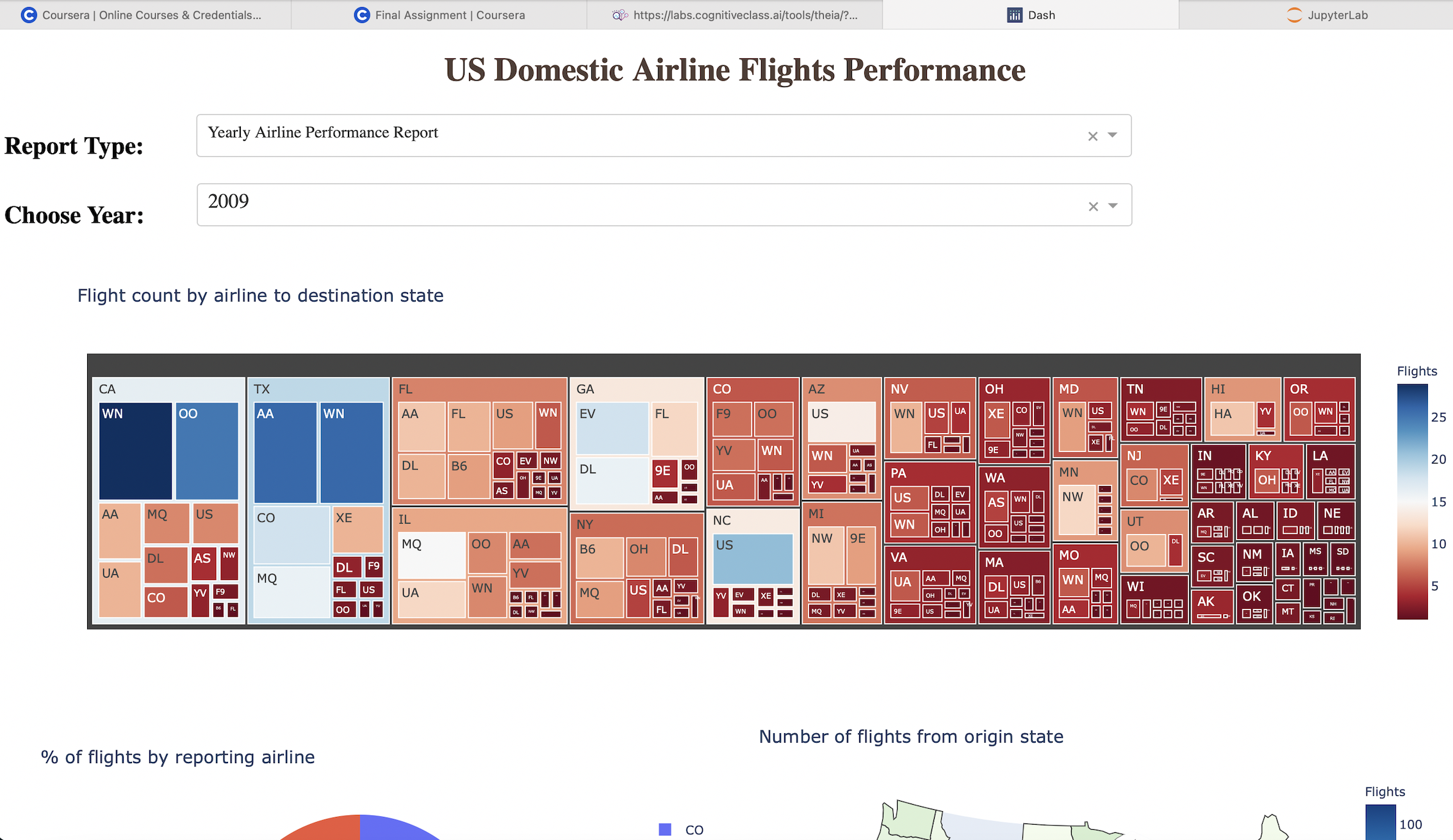
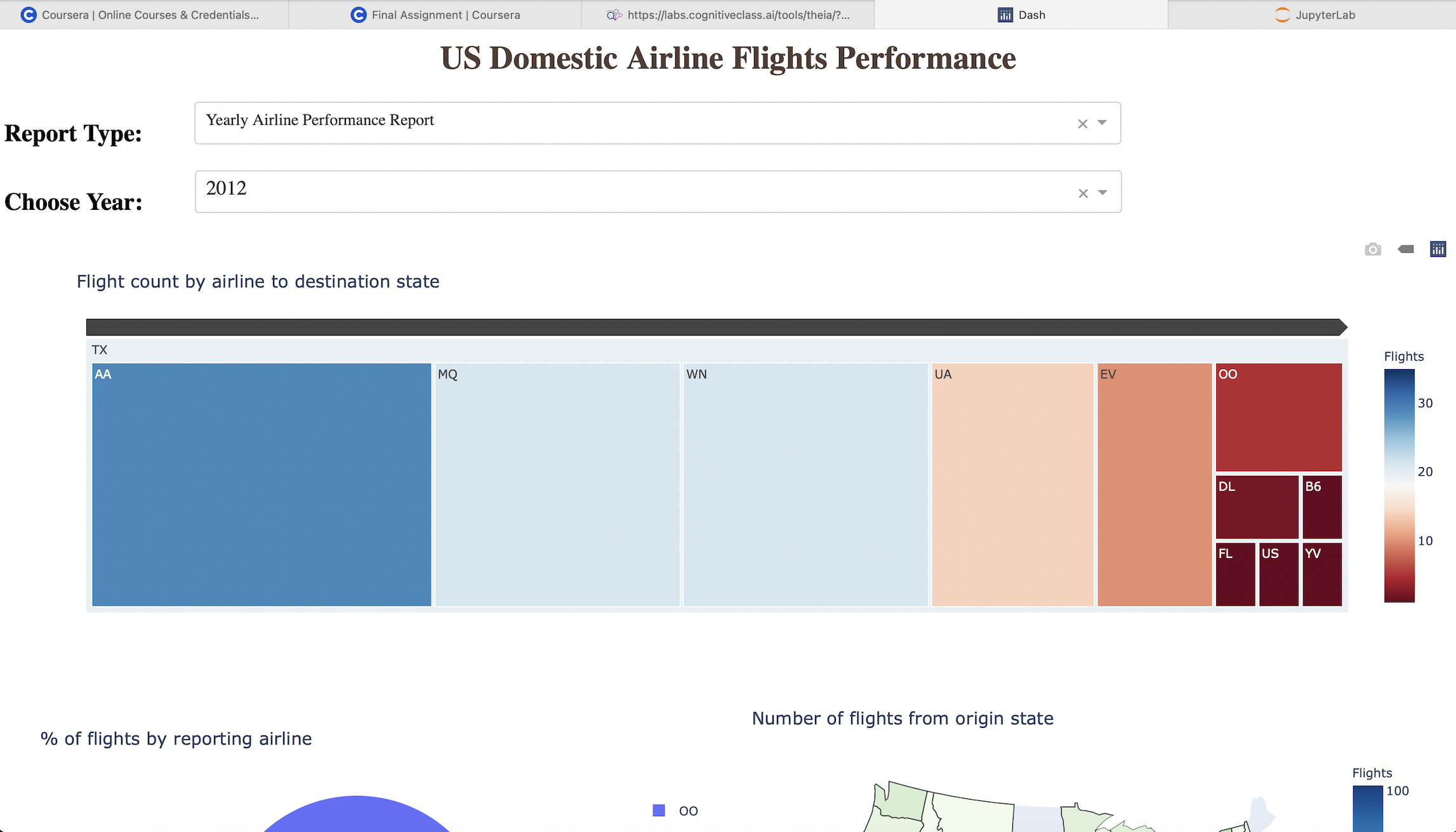
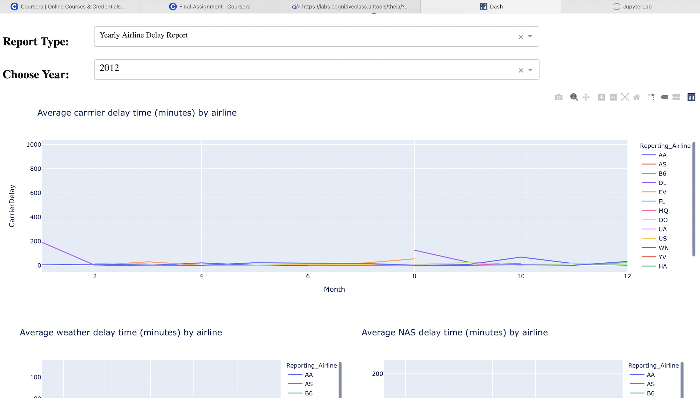
I used various visualization types to display US Domestic Airline Flights Performance and Yearly average flight delay statistics for a given year (2005 to 2020). I group it into an interactive dashboard using Plotly and Dash.
This project is the final Capstone Project of the Data Visualization course from my IBM Data Science Certificate.
Check out the certificate right here: IBM Data Visualization Certificate
Peer review grade: 15/15
The dashboard had been built with the help of: Check out pictures and GitHub for more details about the project!
The dashboard had been built with the help of: Check out pictures and GitHub for more details about the project!